Helping shoppers plan their next digital purchase and/or store visit by making it easy to organize favorite products into shoppable lists.
Date Completed
January, 2022
Overview
CVS Health is one of the United States’ leading pharmacy chains. However, their shopping experience lacked robust functionality for creating and managing shopping lists. The Shopping List initiative addressed a critical gap in the CVS digital experience by enabling customers to plan their shopping trips more effectively. Customers previously relied on inefficient workarounds, such as using their cart or “On Card” tab as makeshift shopping lists, which led to frustration and missed opportunities for engagement.
Recognizing an opportunity to increase customer retention and improve the shopping experience, I advocated for a streamlined, SKU-based favoriting functionality. This feature aimed to simplify list-making while aligning with user behaviors and expectations. Over months of collaboration with cross-functional teams, I produced and presented hundreds of high-fidelity designs. While written list functionality was ultimately descoped, the remaining features are scheduled for development for both iOS and Android in the coming months.
As a newly hired team member stepping into the lead role, I managed the project end-to-end. I collaborated closely with an accessibility designer, product leads, and engineering teams to ensure the solution was inclusive, scalable, and met user needs.
Want to dive deeper?
Download or view the complete project requirements document to explore detailed use cases, acceptance criteria, and rollout strategy
Process
Learning About Shopping List Functionality
Our approach to designing the shopping list experience began with an in-depth review of existing user research, competitive analysis, and previously created high-fidelity mockups assembled in Miro.
User Research
In 2021, CVS launched an ongoing annual study to benchmark the usability of its digital shopping experience across CVS.com and the mobile app. This study aimed to identify pain points and opportunities for enhancing the end-to-end user journey.
Key findings from the first year included:
CVS shoppers reported having adopted the practice of using the cart as a list and often using "save for later" lists to cull the cart but keep track of items they didn't want to forget.
- Many users desired a way to replicate the simplicity of creating shopping lists inspired by the Sunday circular.
- Some users relied on their cart as a pseudo-list, using “Save for Later” to separate must-buy items from those they wanted to remember.
- The existing process for managing shopping lists was overly complicated and did not align with user expectations for simplicity and speed.
Competitive analysis
We conducted a broad survey of competitor platforms, including Target, Walmart, and Star Market, to identify patterns and draw insights. While none of the competitors perfectly mirrored CVS’s use case, notable observations included:
- Target’s approach included both written and SKU-based lists, offering a clear reference point for our design considerations.
- Competitors often failed by mixing multiple intents into a single tool, combining notes, promotions, and favoriting functionality in a way that created clutter and confusion.
From this analysis, we drew a clear directive: Keep the design as simple as possible—do not overload users with unnecessary features.

When making lists, participants tend to use methods that are extremely easy to use. Most rely on pen and paper. When using apps, they choose minimalist tools like Notes. Keep the design as simple as possible. Do not try to add too much to it.
User Research Insights
Our work on the shopping list functionality began with an in-depth examination of user behaviors, challenges, and needs. Leveraging data from CVS’s ongoing annual usability study, we focused on understanding how customers interact with list-making tools within their broader shopping experiences.
Key findings
- Shopping Habits: Many users continued to rely on pen and paper or basic note apps, citing ease of use and familiarity. When engaging with digital tools, simplicity was a non-negotiable requirement.
- Pain Points with Existing Features: Participants using the “On Card” tab for lists faced confusion due to its hidden placement and lack of intuitive design. They sought tools that could better integrate with their shopping journeys.
Emerging Opportunities
A strong desire emerged for a solution that combined
- Quick add-to-list functionality.
- In-app savings notifications.
- Integration with in-store navigation for smoother shopping.
These insights directly shaped our design goals: to create a tool that respects users’ preference for simplicity while adding meaningful functionality that supports their planning and budgeting needs.
Competitive Analysis
To frame CVS’s shopping list feature against industry standards, we performed a comprehensive competitive analysis, evaluating digital tools from retailers like Walmart, Target, and Ikea.
Key Learnings
- Accessibility Challenges: Target’s lists lacked intuitive grouping for screen readers, highlighting a gap in inclusivity across major competitors.
- Unfocused User Intent: Many tools failed to distinguish between different use cases, cluttering the interface with unrelated features like promotional lists, favorites, and notes.
- Missed Functionalities: Features such as real-time notifications for item availability or coupon use were underutilized by competitors, presenting an opportunity for CVS to differentiate its offering.
These findings emphasized the need for CVS to balance simplicity with thoughtful feature integration, setting a clear direction for the ideation phase.
Understanding the Foundations of List-Making for Shoppers
To create a solution that met the needs of CVS customers, I began by breaking down existing research, competitive insights, and identified patterns to synthesize actionable insights. This foundational work provided clarity on how users currently approach list-making and highlighted key gaps in CVS’s existing digital tools.
Synthesizing Research and Patterns
The FigJam boards illustrate the process of analyzing and categorizing research findings. The insights from this step are critical for understanding user expectations and behaviors. These include:
- Conceptual Models: The majority of shoppers approach lists as written records rather than SKU-based compilations. This insight underscores the importance of making the list intuitive and familiar.
- Prioritization on Promotions: While users value promotions, their lists are often structured around specific needs rather than exploratory browsing.
- Integration of Weekly Ads: Weekly ads are a key entry point for users engaging with lists. This is a feature unique to CVS’s ecosystem.
Identifying Problem Patterns
In reviewing competitive experiences (Target, Walmart, and others), several problem patterns emerged:
- Fragmented Actions: Key actions, such as creating a list or filtering, were often split across multiple sections of an interface, leading to confusion.
- Excessive Features: Competitor tools often tried to combine unrelated actions, such as “favorite lists” and “promotions,” diluting the core purpose of list-making.
- Global Navigation Issues: Navigation elements in headers often overwhelmed the user with unnecessary options. These issues were documented in the comparative header analysis, as shown in the attached “Headers Compared” PDF.
The insights from these analyses were used to structure the next steps in defining clear goals and designing solutions.
Problem Patterns in Competitor Solutions
- Fragmentation: Actions like “Make a List” are buried in non-intuitive locations.
- Grouping Issues: Essential elements like “Shop by Category” and “Search” are not grouped logically.
- Overlooked CTAs: Key actions are difficult to identify, as seen in Target’s design.


Header Comparison Analysis
This comparative analysis shows how competitors like Star Market and Costco structure list-building features. While Star Market excels in organizing global elements and list-specific sections, both lack a clear alignment between user goals and available actions. This insight highlighted the need for a balance of usability and functionality in CVS’s headers.
Key Takeaways
This research and competitive analysis established a clear foundation for the CVS list-making functionality. Insights from user research emphasized simplicity and practicality, while the competitive analysis underscored the value of intuitive navigation and purposeful design. These findings informed the next steps of defining goals and ideating solutions that prioritized user needs while leveraging CVS’s unique ecosystem.
Understanding Existing Flows to Ideate New List-Making Solutions
The board presented an early set of comps designed to map existing pages and flows within the CVS mobile app, providing a framework for integrating new list-making functionality. This exercise was critical for aligning proposed solutions with the current system architecture while exploring opportunities to innovate the user experience. By visualizing the relationships between existing pages (like product detail pages, shopping carts, and weekly ads) and potential new features, I was able to identify key touchpoints where the list-making experience could be seamlessly introduced.
These mockups also served as a first pass at rendering solutions as iOS and Android components. This step helped to ensure consistency with CVS’s design system and platform-specific guidelines. While these comps represent the earliest stages of ideation, they reflect a strategic approach to solving user pain points with scalable and contextually integrated solutions.
Key Design Explorations
- Integration Points:Identified where new list-making functionality could be introduced, such as through existing PDP (product detail pages), PLP (product listing pages), and the weekly ad feature. These touch-points aimed to keep users engaged in the list-building flow without unnecessary navigation disruptions.
- UI Components for List-Making Actions:Early mockups explored interactive components like “Add to List” buttons on PDPs and PLPs, confirmation toasts, and bottom sheets for managing lists. These elements aligned with CVS’s existing patterns while introducing new functionality.
- Cross-Selling and Engagement Opportunities:The designs showcased ways to surface related products, promotions, and previously purchased items, providing users with meaningful options to expand their shopping lists. This approach supported CVS’s goal of increasing user engagement and conversion rates.
- Accessibility Considerations:The mockups noted accessibility issues within existing UI elements, providing opportunities to enhance usability for all users. Early identification of these issues ensured that proposed solutions were inclusive and compliant with accessibility standards.
Role in the Understand Phase
This stage exemplified my role as an experience designer tasked with bridging research insights and technical constraints. By grounding the exploration in real-world flows and existing UI components, I demonstrated how new features could enhance the customer journey while integrating seamlessly into the app’s ecosystem. These early designs were not final solutions but rather critical tools for driving discussions with stakeholders, iterating on functionality, and preparing for user testing in the later phases.
This effort highlights my ability to work within system constraints while ideating innovative solutions to meet user needs, ultimately setting the stage for a cohesive and user-centered design process.
Defining a Design Direction Through Testing
In the “Define” phase of this project, I focused on establishing a clear understanding of the user challenges associated with list-making functionality in the CVS app. This stage bridges insights from prior research into actionable hypotheses and prepares the groundwork for solution validation. Utilizing the CVS shared services UXR team’s unmoderated user testing template, I defined the research goals and created a testing framework to evaluate an early prototype.
- Does combining tiles (SKU-based entries) and manually added items (text entries) on the list page create confusion for users?
- What are users’ first impressions of the hybrid list UI?
- Can users identify and understand the available actions, such as adding manual items or using search functionality?
- How easily can users complete key tasks, such as adding manual list entries, and what time metrics reflect this ease?
Contextual Process Explanation
To align with the broader process, this testing initiative served to validate assumptions derived from the “Understand” stage and refine hypotheses based on synthesized insights. By examining user interactions with a hybrid prototype that combined SKU-based and manual text entry functionality, we aimed to clarify whether this model met user expectations and addressed common pain points in the list-making journey.
This board documents the testing preparation in detail, showcasing the research goals, participant journey, and metrics established for evaluating the prototype. It serves as both a visual representation of the structured testing process and evidence of cross-functional collaboration with UX researchers and stakeholders.
Observing the Hybrid UI in Action
The prototype, developed to reflect the hybrid list-making approach, was presented to participants through unmoderated user tests. The goal was to assess real-world usability by observing task completion rates, error occurrences, and qualitative feedback from participants.
The prototype image represents the interface users tested, reflecting the hybrid design that integrates SKU-based entries and manual text input functionality.

Highlights of Findings
- Discoverability: Users were able to locate and interact with the manual text entry functionality, though initial hesitation suggested opportunities for improving discoverability.
- Ease of Use: Most participants completed tasks with ease, indicating that the hybrid UI was broadly intuitive.
- Visual Hierarchy: Feedback revealed that a clearer visual hierarchy between manual and SKU-based entries could enhance clarity.
Value of this Stage
By testing an early version of the design, this stage allowed us to identify critical usability challenges while validating the overarching concept of a hybrid list-making interface. These findings directly informed subsequent iterations in the “Ideate” and “Prototype” phases, ensuring a user-centered design process that addressed genuine pain points.
Ideating Flexible and Scalable Solutions
The “Ideate” phase of this project focused on translating insights from user testing into scalable design solutions. Leveraging the power of atomic design principles, I developed nested components that allowed for seamless updates across hundreds of screens, enabling real-time collaboration and efficient iteration during meetings with product managers and directors.
Ideation goals
- Develop high-fidelity UI flows to gather feedback from product leads and stakeholders.
- Identify technical constraints and opportunities for UI refinement.
- Explore alternatives to designs with usability challenges, such as the hybrid text and SKU list interface.
Insights from user testing
Testing revealed critical challenges in the hybrid text and SKU list UI:
- Search Field Misalignment: The global search bar was misinterpreted by users as a tool for finding shopping items, turning the list-making process into a duplicate of the product listing page experience.
- Separation of Controls and Content: Placing SKU items above written entries led to a disconnect between controls and their associated content, reducing usability.
- Unclear Written Entry Integration: Users struggled to distinguish between written entries and SKU-based items due to insufficient visual hierarchy.
- Due to their importance for one click conversion SKUs on the list appear above written entries. This separates written entries from their controls and pushes them below the fold
To address these challenges, I explored iterative solutions that balanced user needs with technical feasibility, ensuring alignment with CVS’s existing design ecosystem.

Driving Efficiency in Real-Time
By adopting an atomic design approach, I created nested components that allowed for cascading updates across the entire UI. This modular structure enabled rapid iteration and real-time feedback implementation during stakeholder reviews. For example:
- Adjustments to global headers or buttons automatically propagated across all screens, ensuring consistency.
- Stakeholder suggestions could be visualized instantly, facilitating collaborative decision-making and reducing iteration cycles.


Iterative Solutions and Refinements
As part of this phase, several design iterations were proposed and evaluated:
A number of other iterations were under discussion
- Alternative Input Controls: Replacing dual input fields with a single dropdown selector to streamline the user flow and reduce cognitive load.
- Filter Integration: Exploring truncated filter sets and modal-based solutions to declutter the UI while preserving functionality.
- Reorganized Hierarchy: Adjusting visual hierarchy to prioritize SKU-based items for conversion while maintaining accessibility to written entries.
Value of Collaboration and Iterative Design
This ideation process demonstrated the value of flexible design systems in enterprise environments. The ability to iterate rapidly and adapt to feedback not only improved the quality of the designs but also strengthened cross-functional collaboration. These solutions laid the groundwork for the “Prototype” phase, where further usability testing and refinement would ensure a user-centered approach to implementation.
Prototyping and Refinement
The Prototyping stage was pivotal in validating the most viable solutions for CVS’s shopping list functionality. This stage involved creating a detailed prototype that integrated findings from earlier user research and ideation phases. The goal was to test the hybrid list model combining written text entries with SKU-based product listings while addressing usability issues identified in the testing stage.
Key Prototype Features
- Hybrid Interface Testing: The prototype offered a clear separation between manual text-based entries and product SKUs, with improved visual hierarchy to minimize user confusion.
- Navigation Enhancements: Adjustments to the global search bar and filter placement were incorporated to better align the list-making process with users’ mental models.
- Component Efficiency: Leveraging CVS’s design system, I developed nested components using an atomic structure, allowing for real-time cascading edits across the entire prototype. This enabled swift iteration in collaborative meetings with product leads and directors.
Value of the Prototype
The prototype provided actionable insights into the hybrid list concept’s feasibility, confirming areas that required simplification for clarity. It also demonstrated the effectiveness of an atomic design approach, which allowed the team to test multiple variations of components without reworking the broader structure.
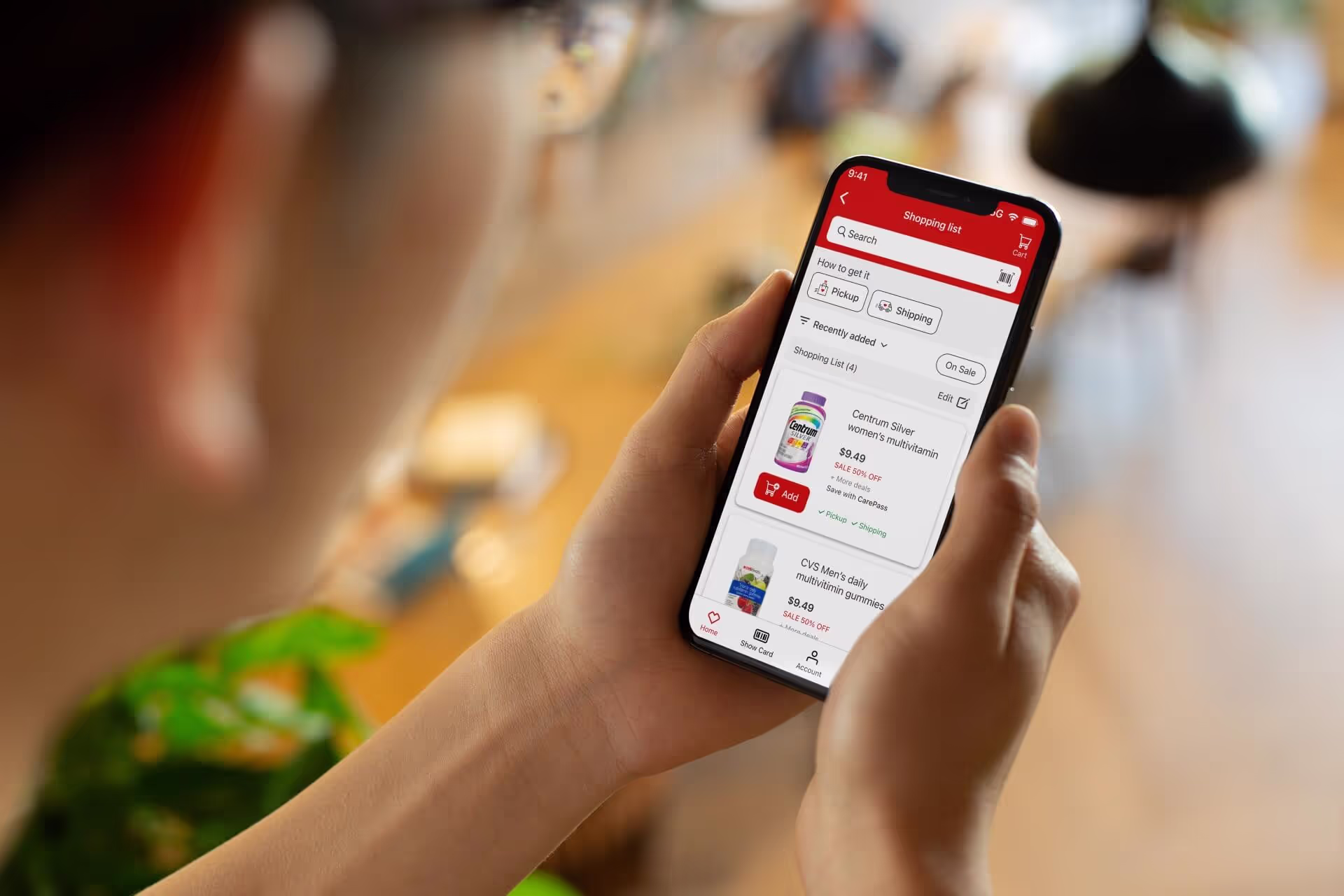
Final Prototype Visualization (with written list)
Preparing for Development and Handoff
After finalizing the prototype, the focus shifted to preparing assets for handoff to engineering and other designers at CVS. This stage ensured that the design’s complexity was distilled into actionable development deliverables while maintaining consistency with the broader design system. The thorough preparation provided resources that could be reused and adapted for future updates, making the process highly efficient and scalable.
Key Deliverables
- Finalized Component Library: A comprehensive set of components was developed, ensuring compatibility with both iOS and Android platforms. These components adhered to CVS’s accessibility standards, ensuring inclusivity and compliance with WCAG 2.1. The atomic structure of these components allowed for cascading edits, enabling rapid updates and seamless collaboration during live meetings with stakeholders.inclusivity.
- Accessibility-First Design: Detailed annotations were added to ensure the experience met accessibility guidelines. These notes focused on critical aspects such as dynamic controls, tap target sizes, and contrast ratios, ensuring the interface could serve a diverse user base. The work highlights my collaboration with accessibility specialists to meet CVS’s inclusive design goals.
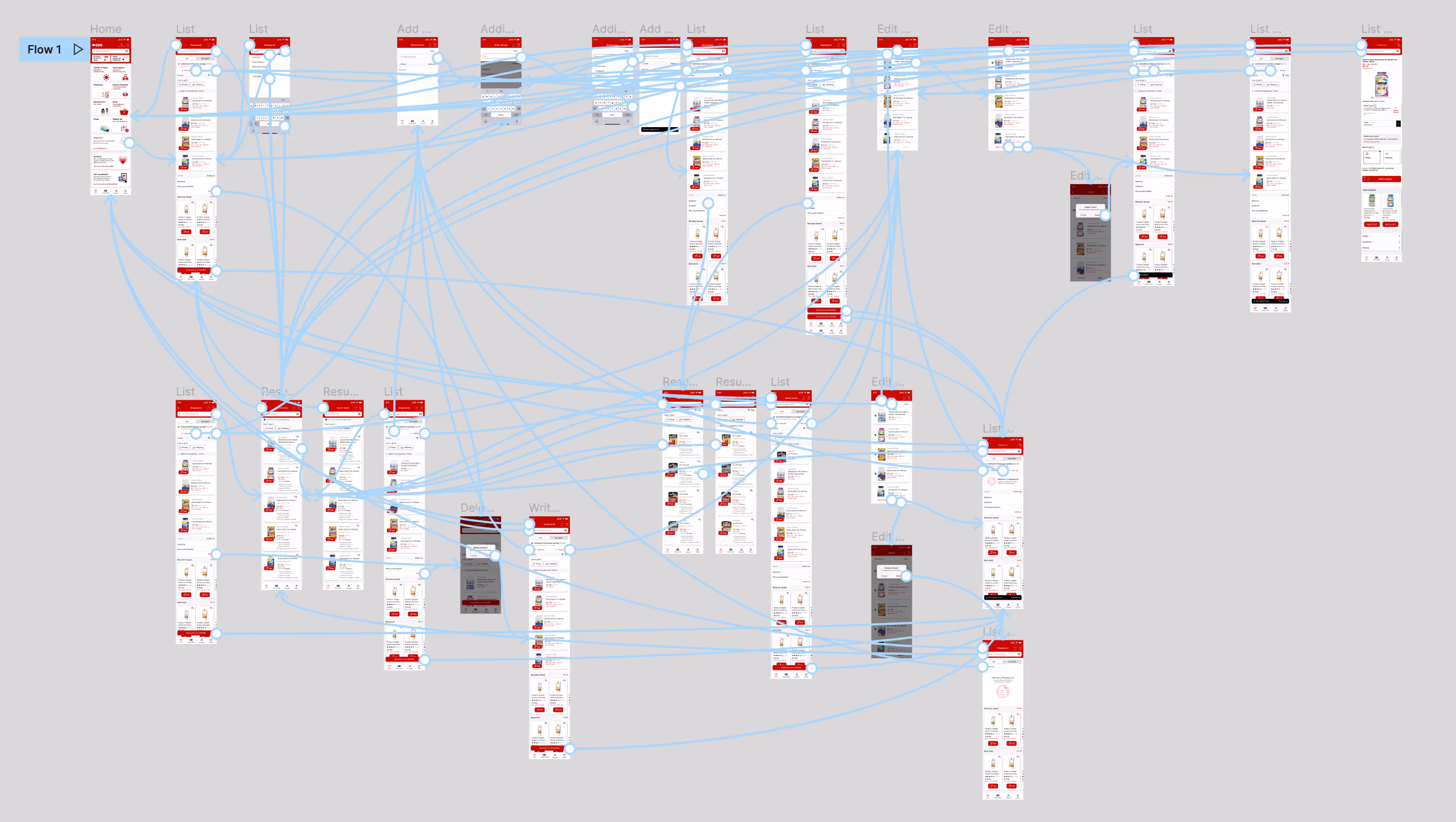
- Collaborative Tools: Figma boards with interactive flows, annotations, and detailed specifications were handed off to the engineering team. This approach minimized ambiguity and streamlined development cycles, enabling precise execution of the intended design.
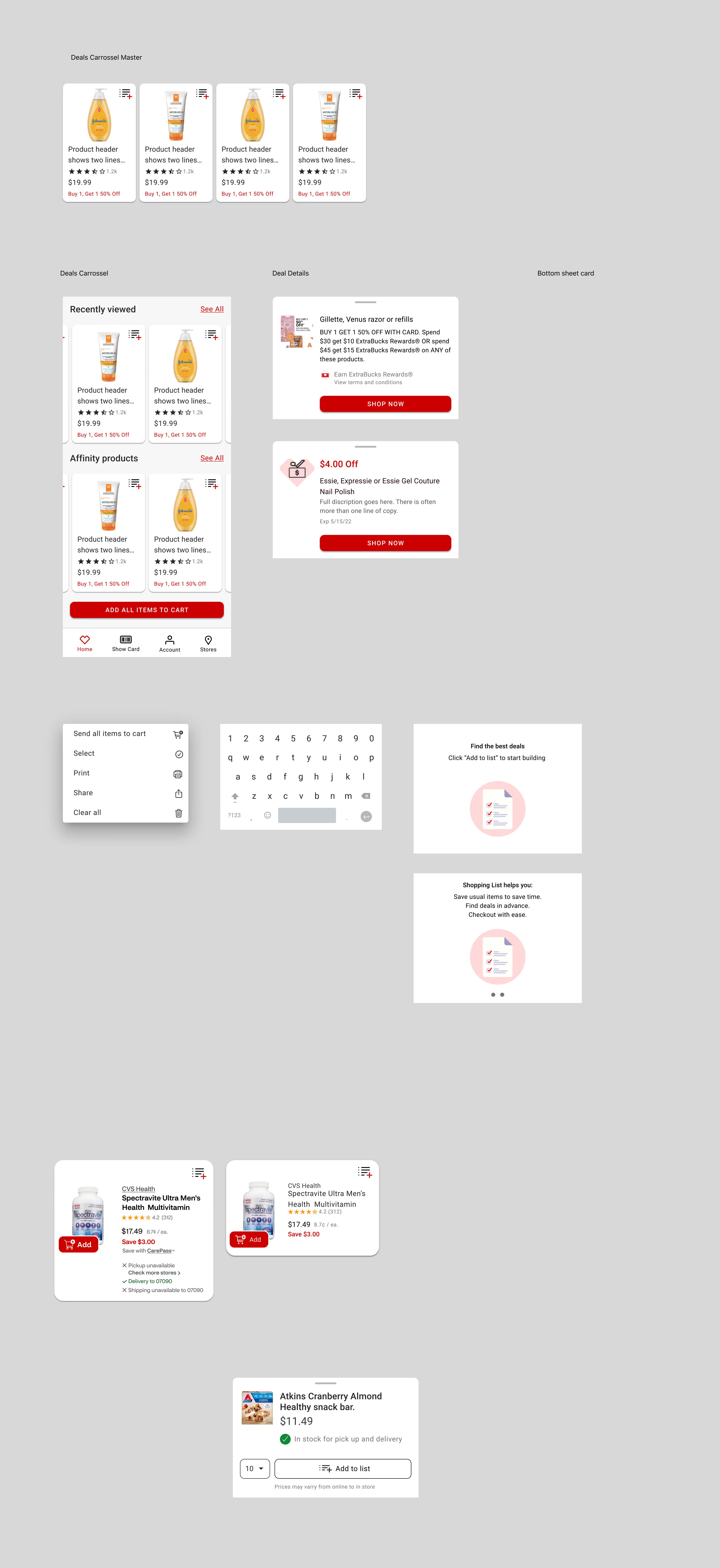
Design Final File
This file showcases expert-level design delivery skills. It acts as a resource for future designers and enables cascading edits, a powerful time-saving strategy. The structure of the file allows for easy scalability and demonstrates my ability to think ahead to the long-term usability of my work.
Collaborative Tools
This file demonstrates the breadth of perfected screens produced during the project. It highlights my ability to address development concerns such as tap surfaces, responsiveness, and interaction flows. By constructing files with development needs in mind, the handoff process was smooth and efficient.
Prototypes were used to present work and gather feedback on work and numerous points to facilitate iterations and improvements.
Accessibility Annotations
These annotations showcase my collaboration with accessibility designers to ensure the final product met all necessary guidelines. The files serve as proof of my ability to incorporate specialized requirements and advocate for inclusive user experiences.
Reflections & takeaways
This project underscored the complexities of integrating hybrid functionality into a native app environment, particularly within the constraints of existing merchandising infrastructure. While the hybrid list concept presented significant usability advantages, the final direction prioritized SKU-based lists to align with product strategies.
Lessons Learned
Taking a cue from the speed at which user testing participants engaged the prototype and ended up searching, I pushed for search and add from PLP as the solution.
- Iterative Collaboration is Key: Real-time updates during meetings with stakeholders ensured the design addressed both user and business needs.
- Accessibility Drives Innovation: Designing for inclusivity enriched the experience for all users and highlighted gaps in CVS’s broader ecosystem.
- Adaptability is Essential: Pivoting from hybrid lists to SKU-based functionality demonstrated the importance of aligning design goals with technical and strategic constraints.
Final Thoughts
Although the prototype did not fully incorporate written lists, the iterative process established a strong foundation for future exploration of list-making functionality. By focusing on user needs and leveraging a modular design approach, the project delivered scalable solutions aligned with CVS’s broader digital strategy.