Redesigning the over the counter health care services app for increased conversion with BJ Fogg's behaviors and triggers

Date Completed
June, 2023
Overview
CVS provides health care plan-based accounts for health and healthy food goods through its Over-the-Counter Health Solutions (OTCHS) program. These accounts represent a significant portion of CVS revenue; however, the existing web-based experience was outdated, and no native mobile experience had been developed.
At the request of my digital director, I assumed the role of point person for OTCHS. My responsibilities included driving the redesign effort while ensuring inclusivity and accessibility by collaborating closely with an accessibility designer. Together, we reviewed the high-fidelity user interface designs created by CVS teams, which were later adopted by an external agency for development.
To address the complexities of the existing solution, I spearheaded an initiative to create an extensive system map. This comprehensive map illustrated the relationships between current web and native screens, user goals, and business objectives. It became the foundation for discussions among cross-functional teams, aligning stakeholders on priorities and opportunities for improvement.
Working closely with CVS product leads and external design teams, I designed a new user flow that incorporated improved messaging for user motivation and triggers, grounded in BJ Fogg’s behavior model. My strategic leadership ensured that the redesign addressed known UX challenges, met business goals, and provided a user-centered foundation for the future of OTCHS.
View the current version on the App StoreThe application is now live in app stores, and key outcomes from this effort include improved adoption rates and reduced transaction completion times for users. A standout feature of the redesign was the implementation of camera-based, in-store shopping functionality, allowing users to visually identify which items were eligible for purchase with their benefit. While the current app in stores reflects an earlier version of the UX design and information architecture, the groundwork laid in this effort positions the app for further evolution, aligning with the updated UI presented in this case study.
Strategic Feature Enhancements
- Dual Account Integration: Introduced a second account for healthy food purchases, ensuring clear separation of benefits and eliminating user confusion during product selection. This aligns with business objectives to streamline transactions and improve user satisfaction.
- Camera-Based In-Store Shopping: Implemented multi-SKU scanning functionality, allowing users to visually confirm eligible products in real time. This innovation reduced transaction times and significantly enhanced the shopping experience.
- Cart Persistence Across Benefits: Enabled cross-account cart functionality with a time-limited hold, improving user convenience and reducing the likelihood of incomplete transactions.
Before

After

Process
Building a Foundation for Redesign
Without a clearly defined scope, I began by immersing myself in the current OTCHS app and web solutions. To create a comprehensive understanding of the existing experience, I constructed detailed system maps documenting the end-to-end flows for both mobile and web applications. These maps captured the relationships between screens, the user journey, and inefficiencies within the current structure.
Screens Collected

Visualizing Current States
The collected screens from the app and web platforms were mapped (see “Screens Collected” board). This visualization served as a critical foundation for analyzing gaps, redundancies, and misalignments with user goals. By creating flow diagrams (see “Flows by Platform” board), I was able to illustrate how the user interface, task flows, and business objectives either aligned or fell short.
This process started with a series of collaborative meetings involving a group of external contractors who had produced an earlier solution for the native application. During these discussions, files from their work were shared, and I gained access to their previously developed screens. My initial task was to extract these screens from their files, consolidate them, and organize them into cohesive flows to gain clarity on how the application functioned from a user’s perspective.
The screenshots included here depict the early stages of this work, where screens were collected and analyzed. Using this collection, I created detailed flow diagrams that provided a clearer picture of the application’s structure and usability. The accompanying board highlights the resulting flows, showing the relationships between screens and how they translated into user interactions. This foundational step allowed me to identify critical areas for improvement and prioritize them for redesign discussions.
Initial Observations and Critique
Through this mapping, I conducted a heuristic evaluation focused on usability, consistency, and alignment with user-centered principles. Key insights included:
- The homepage design’s use of a wallet-like card caused confusion.
- Fragmentation of critical features (balances, activity, and scanning) diminished usability.
- Purchasing paths were not clearly grouped by benefit type, increasing cognitive load.
- The scan feature lacked context, leading to ambiguity about its purpose for in-store payment.
- Scanning functionality doubled as search, creating redundant screens and workflows.
- Search functionality overall did not align with the users’ goals or the app’s context.
These issues were documented and prepared for discussion with product managers and directors to prioritize solutions and inform release planning. The work completed during the Learn stage became the foundation for defining the redesign strategy, balancing technical constraints, and aligning the app’s functionality with user and business needs.
Flows By Platform
Initial Observations and Critique
Through this mapping, I conducted a heuristic evaluation focused on usability, consistency, and alignment with user-centered principles. Key insights included:
- The homepage design’s use of a wallet-like card caused confusion.
- Fragmentation of critical features (balances, activity, and scanning) diminished usability.
- Purchasing paths were not clearly grouped by benefit type, increasing cognitive load.
- The scan feature lacked context, leading to ambiguity about its purpose for in-store payment.
- Scanning functionality doubled as search, creating redundant screens and workflows.
- Search functionality overall did not align with the users’ goals or the app’s context.
These issues were documented and prepared for discussion with product managers and directors to prioritize solutions and inform release planning. The work completed during the Learn stage became the foundation for defining the redesign strategy, balancing technical constraints, and aligning the app’s functionality with user and business needs.
Clarifying the Role of the Native Application
With the introduction of the account feature for healthy foods, the native application was primarily positioned as a tool for in-store shopping. The central functionality—scanning products to determine eligibility for benefits—was crucial for this use case. However, a deeper analysis of the existing design revealed gaps in how this functionality was communicated and how it integrated into the broader user journey.
To better understand the design decisions behind the scanning feature, I reviewed the screens inherited from the external team and held meetings with one of the designers involved in the original effort. While the designer could not fully explain the rationale for some architectural choices, these discussions confirmed the need for further exploration of technical feasibility and user needs.
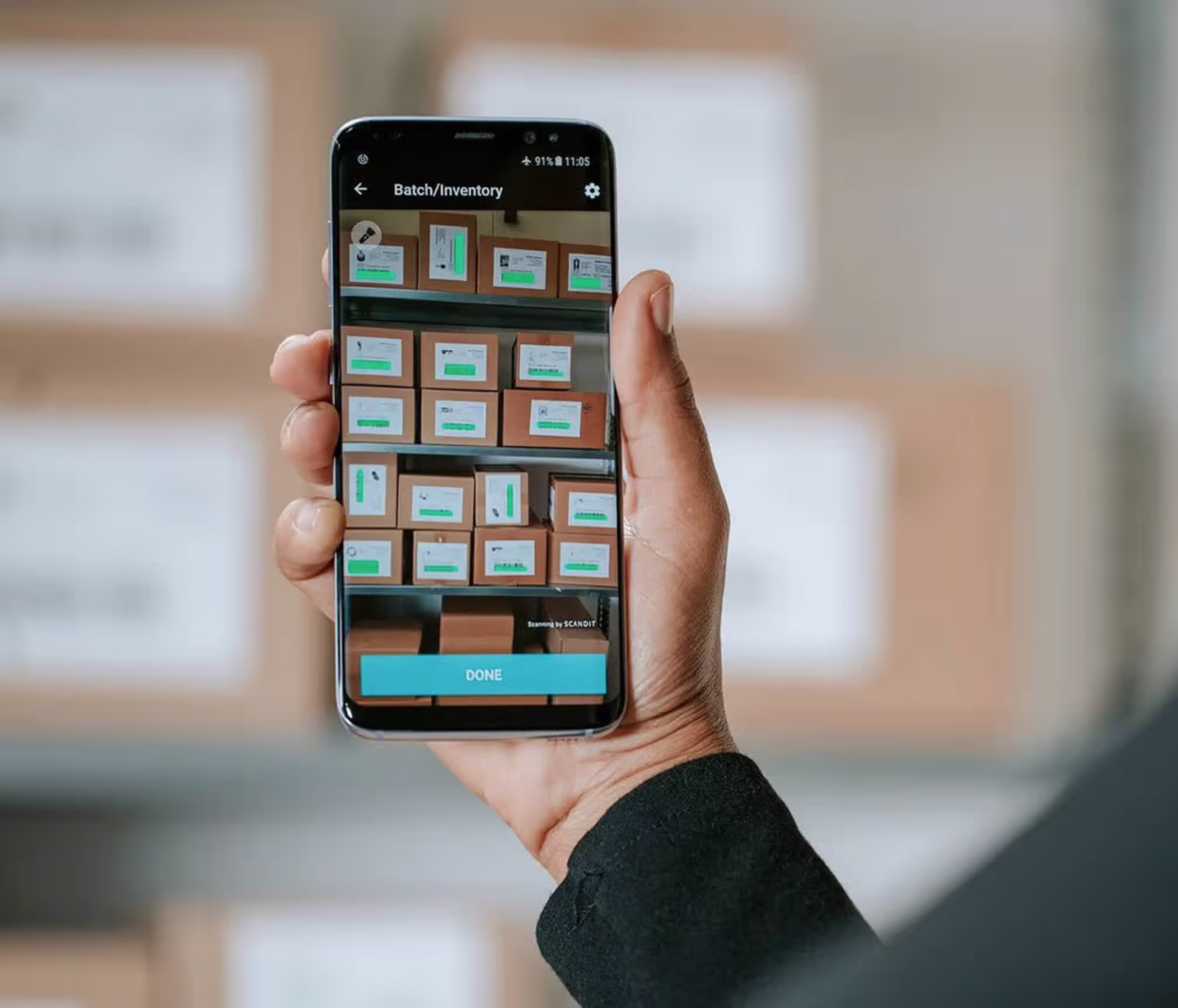
Scandit produces a scanning SDK which can recognize batches of barcodes. This software works in difficult conditions like low light, and on devices without autofocus.
Bridging Design with Technical Constraints
A pivotal insight emerged when researching the scanning feature. I discovered the team had implemented a third-party SDK, Scandit, capable of recognizing barcodes in challenging environments like low-light conditions. This informed our decisions on how to position the scanning feature within the app’s architecture and release planning.
To align with technical feasibility and business objectives, I expanded the system maps to illustrate the integration points between existing web-based interfaces and native app components. These maps became essential for:
- Prioritizing which web-based screens to preserve and adapt for the initial release.
- Highlighting where UI modifications were necessary to maintain user experience consistency.
- Facilitating discussions with engineering on technical opportunities and limitations.

Most reported it would be unlikely they would download an app or use a mobile phone to manage the benefit.
User Insights Shape Prioritization
Given the older, less technical demographic of the app’s users, I conducted informal interviews with individuals familiar with OTCHS benefits. These interviews confirmed that most users engaged with the benefits via desktop interfaces or mailed documentation and were unlikely to adopt mobile tools unless they clearly addressed pain points. Specific findings included:
- Desktop was the primary channel for benefit use.
- In-store shopping was seen as convenient, with users motivated by the ability to confirm product eligibility directly.
- Paper-based methods were still widely used and trusted.
- Many expressed reluctance to use a mobile app unless it was simple and intuitive.
These insights guided our decisions to prioritize ease of use, consolidating essential features, and reducing cognitive load in early releases.
Strategic Release Planning
The System Maps and Platforms board (attached earlier) illustrates how these insights translated into our phased release strategy. By focusing on user-impactful features like in-store scanning and balance consolidation, we ensured that initial releases aligned with user needs while addressing technical constraints. Subsequent releases would introduce enhancements like better search functionality and expanded purchase pathways.
Designing with Behavioral Insights: Defining User-Centered Strategies
With a robust understanding of the existing application and its constraints, as well as the alignment achieved with external contractors and internal stakeholders on the technical feasibility and release strategy, it was time to focus on the user. Transitioning from prioritizing what was technically possible to ensuring the solution supported user intent, I began analyzing the behaviors, motivations, and challenges of our target audience.
This stage represented a critical pivot, where I moved beyond the immediate constraints of engineering timelines and release schedules to deeply consider how the application could meet users’ goals. Drawing on insights from behavior scientist BJ Fogg’s Behavior Model, I explored how to design intuitive and motivating interactions, leveraging effective triggers to bridge the gap between user intent and application capability.
Behavior-Driven Analysis
The Fogg Behavior Model, which frames behavior as a function of motivation, ability, and triggers, served as a foundational lens for this stage. For the OTCHS app, user motivation was high due to the financial savings associated with benefit utilization. However, the ability to act was often hindered by the app’s complexity and lack of clarity in task flows. Effective triggers, therefore, became a critical design focus to drive engagement and streamline interactions.


Key Observations and Insights
Addressing these challenges required not only a conceptual redesign of key screens but also a deeper understanding of how to reduce friction in user journeys. I proposed the following adjustments to align user intent with product functionality:
- Misaligned Hierarchy and Navigation
The app’s wallet-like interface placed unnecessary emphasis on balances, which confused users by mimicking financial applications rather than a shopping-oriented tool. This misalignment created cognitive dissonance, requiring rethinking the hierarchy and clarity of actionable elements. - Contextual Scanning
The app’s scanning functionality lacked the necessary context for users to understand its purpose. Scanning was intended for in-store purchase eligibility but was misconstrued as a search function, resulting in redundant workflows. Clearer affordances and instructional cues were necessary to align user expectations with functionality. - Contextual Scanning
The app’s scanning functionality lacked the necessary context for users to understand its purpose. Scanning was intended for in-store purchase eligibility but was misconstrued as a search function, resulting in redundant workflows. Clearer affordances and instructional cues were necessary to align user expectations with functionality. - Accessible Triggers for Demographics
Given the app’s primary audience—older users with varying levels of technological literacy—it was crucial to simplify navigation and make core actions like shopping and scanning immediately apparent and accessible.
Designing for Simplicity and Success
- Streamlining the User Flow: By restructuring the homepage to focus on immediate actions (e.g., shopping and scanning), I aimed to reduce cognitive overload and guide users seamlessly to their goals.
- Contextual Visual Hierarchy: Leveraging principles of typography, spacing, and color contrast, I emphasized actionable elements like “Shop” while deprioritizing static content such as balances.
- Trigger Optimization: Drawing on insights from the Fogg model, I integrated visual and textual cues at decision points to increase clarity and reduce user hesitation. For example, scan functionality was repositioned with a clear label indicating its purpose and limitations.
Aligning the Application with User Intent
Armed with insights from the analysis and informed by BJ Fogg’s Behavior Model (B=MAP), the design shifted focus to aligning the application with user intent. According to Fogg’s model, behavior (B) occurs when Motivation (M), Ability (A), and a Prompt (P) converge. With users highly motivated to utilize their benefits for financial savings, the design aimed to enhance their ability to navigate the app seamlessly while providing clear and actionable prompts.
While the application’s initial wallet-like design captured its functionality for managing multiple OTCHS accounts, it fell short in supporting the primary user goal: making purchases. This realization informed the design’s pivot towards a shopping-first approach, streamlining user actions and clarifying the app’s purpose.
Reframing the App’s Primary Purpose
While the application’s initial wallet-like design captured its functionality for managing multiple OTCHS accounts, it fell short in supporting the primary user goal: making purchases. This realization informed the design’s pivot towards a shopping-first approach, streamlining user actions and clarifying the app’s purpose.
Key design changes included:
- A Direct and Succinct Introduction: A simple instructional sentence placed in the top left corner clarified the app’s utility for both in-store shopping and online product browsing. This effectively set the user’s expectations and supported immediate task orientation.
- Tappable Tiles as Standard Interaction Patterns: Each tile was designed as a tappable surface, ensuring intuitive navigation. This pattern was consistent with established design standards, allowing users to view account details easily.
- Enhanced Barcode Accessibility for In-Store Purchases:The design prominently surfaced barcodes for in-store scanning, enabling users to complete purchases efficiently. While the layout grouped the two barcodes closely, future testing would determine whether their proximity led to scanning errors or confusion.
- Refining the Hierarchy of Information:Key details, such as benefit balances and eligibility, were visually prioritized. The “View Benefit Details” link was appropriately downplayed, reducing cognitive overload while maintaining accessibility.
- Prominent Call-to-Action Buttons for Shopping:Standard buttons for both in-store and online shopping were introduced, visually grouped and given equal prominence. This ensured that both primary use cases—shopping online and scanning in-store—were treated as equally important pathways.

Visual Representation of Redesign
The updated design was showcased in a clickable prototype (see attached board), allowing stakeholders and potential users to experience the changes firsthand. This representation highlighted:
- User-Centered Interactions: Redesigned flows reduced confusion and supported user goals with intuitive actions.
- Streamlined Task Completion: Core functions like shopping and scanning were prioritized, improving the overall experience.
- Accessibility for Demographics: Simplified navigation and clear visual cues catered to the app’s primary audience, ensuring inclusivity and ease of use.
Next Steps and Opportunities for Improvement
While the redesigned prototype successfully aligned the app with user intent, further usability testing would explore:
- Proximity of Barcodes: Ensuring the layout minimizes potential errors in scanning.
- Accessibility Considerations: Refining visual contrasts and button placements for users with limited technological literacy.
- Behavioral Cues: Testing the effectiveness of prompts in driving user actions and measuring their impact on engagement.
Reflections & takeaways
Reflecting on this project, the redesign of the OTCHS app underscored the importance of balancing technical constraints, business objectives, and user needs within a complex enterprise environment. The process was both strategic and iterative, offering valuable insights and reinforcing key design principles.
- Prioritizing User Intent in a Resource-Constrained Environment: While the project began with clear time and technical limitations, visualizing the existing experience and aligning stakeholders allowed us to identify what was feasible for early releases. The ability to step back from immediate constraints and focus on the user’s core goals—shopping in-store and online—ultimately shaped a solution that balanced practicality with user-centered design.
- Leveraging Behavioral Science to Drive Engagement: Integrating BJ Fogg’s Behavior Model into the design process provided a structured framework to understand user motivations and simplify actions. By reducing friction, clarifying prompts, and enhancing the app’s visual hierarchy, we enabled users to complete key tasks with less effort, improving usability and supporting adoption.
- Collaboration Across Teams
Working closely with external contractors, internal product teams, and engineering stakeholders emphasized the value of shared understanding. System maps and flow diagrams served as critical tools for aligning teams, informing technical decisions, and prioritizing release schedules without compromising the integrity of the user experience. - Building for Real Users, Not Assumptions
Through informal user research and interviews, I gained critical insights into the app’s primary audience: older users who are motivated to save money but may struggle with complex digital interactions. This reinforced the need for clear CTAs, simplified navigation, and contextual cues, ensuring the design was accessible and intuitive for all users.
Key Outcomes
The project delivered tangible improvements to the OTCHS application, including:
- Enhanced adoption rates driven by clearer pathways for online and in-store shopping.
- Streamlined user flows that prioritized shopping actions and reduced cognitive load.
- Improved task completion times by aligning functionality with user intent and expectations.
Looking Ahead
This project reaffirmed the importance of strategic alignment between user needs, business goals, and technical execution. Moving forward, further testing and iterations can continue to refine the experience, ensuring it evolves alongside user behavior and expectations.