Driving promotional engagement, restoring browsing continuity, and modernizing circular shopping with structured UX improvements

Date Completed
April, 2023
Overview
The Weekly Ad feature is one of CVS’s most popular tools, offering customers personalized deals tailored to their local stores. However, its initial implementation faced significant challenges, including usability issues, inconsistent design across platforms, and limited accessibility. These problems negatively impacted customer engagement and satisfaction, as navigating the Weekly Ad was neither intuitive nor efficient.
To address these challenges, I led the redesign of the Weekly Ad experience at the request of CVS product leadership. My role involved improving the information architecture, refining filter functionality, and redesigning key UI components, such as deal tiles and navigation patterns. The focus was on creating a cohesive and accessible experience across web and mobile platforms.
By leveraging insights from user research and applying design best practices, I developed a streamlined solution that improved navigation, engagement, and accessibility. The redesign not only simplified the user journey but also established a consistent and intuitive interface that aligns with CVS’s commitment to enhancing digital customer experiences.
Accomplishments and Key Improvements
- Streamlined Navigation: Introduced a clear tab system for Weekly Ad versions, improving discoverability and functionality.
- Enhanced Filter Functionality: Simplified filtering options to provide a seamless experience across web and mobile.
- Optimized Deal Tiles: Designed consistent, tappable tiles that adhere to accessibility best practices and provide clear interaction cues.
- Improved Visual Hierarchy: Utilized design patterns that reduce clutter and enhance focus on content.
- Device Consistency: Unified the layout and interactions across desktop and mobile platforms, ensuring a cohesive experience.

Heuristics Evaluation of Weekly Ad Page View
To begin improving the CVS Weekly Ad experience, I conducted an in-depth heuristic evaluation of the existing PageView and ListView interfaces. This evaluation focused on identifying breakdowns in user interaction patterns, visual hierarchy, component semantics, and accessibility.
Rather than following a full discovery process, this case study is structured around a rigorous, element-by-element analysis of the current design against usability heuristics adapted from Nielsen Norman Group’s foundational principles. Each element (such as navigation controls, filters, store selectors, and action buttons) is evaluated individually, with findings directly tied to violations of core UX principles.
The objective of this evaluation is to expose critical usability and design system issues in the current experience, providing a structured, actionable foundation for a future redesign.
1.1 View-Mode Toggle (List ⇄ Page)
- Incorrect Control Type and Placement for View Toggle:
The “List View / Page View” control not only misuses tab styling, but also misapplies navigation patterns entirely. Tabs are intended for navigating between distinct sections of content, not toggling visual representations of the same dataset. The correct control pattern would be a segmented control or toggle group. Additionally, the view toggle is misplaced among navigational selectors (store, date, print), when it should be grouped with display setting controls, such as filters or sort options. This misuse confuses content navigation with content presentation, increasing cognitive friction and breaking standard information architecture expectations. (Violates: Consistency & standards · Match between system and real world · Recognition rather than recall)
- No visual affordance: The selector’s styling matches static text; nothing suggests it can be clicked or tapped. (Violates: Recognition rather than recall · Consistency & standards)
- Ambiguous label: The prefix “Current store:” reads as a status message, not an interactive control. It gives no hint that a change action is available. (Violates: Match between system and real world · Visibility of system status)
- Missing interactive feedback: Hover, focus, and active states are absent. Users receive no visual confirmation that the element is actionable or has been pressed. (Violates: Visibility of system status · Error prevention)

- Poor visual grouping: The selector sits inline with date and print controls, with no icon or caret to separate it as a distinct function. Hierarchy does not reflect its critical role. (Violates: Aesthetic & minimalist design · Visual hierarchy)
- Hidden pathway to change location: Users who do discover the control are taken out of context to a full store-locator flow, losing the flyer view and scroll position. (Violates: User control & freedom · Flexibility & efficiency of use)
- Critical action buried on mobile: On small screens the selector is compressed into a single line of text, reducing tap-target size and further masking interactivity. (Violates: Responsiveness & mobile design integrity · Accessibility
1.2 Store Location Selector
- No visual affordance: The selector’s styling matches static text; nothing suggests it can be clicked or tapped. (Violates: Recognition rather than recall · Consistency & standards)
- Ambiguous label: The prefix “Current store:” reads as a status message, not an interactive control. It gives no hint that a change action is available. (Violates: Match between system and real world · Visibility of system status)

- Missing interactive feedback: Hover, focus, and active states are absent. Users receive no visual confirmation that the element is actionable or has been pressed. (Violates: Visibility of system status · Error prevention)
- Poor visual grouping: The selector sits inline with date and print controls, with no icon or caret to separate it as a distinct function. Hierarchy does not reflect its critical role. (Violates: Aesthetic & minimalist design · Visual hierarchy)
- Absence of Interactive Feedback:
The toggle lacks visual states for hover, focus, or active interaction. There is no system feedback to reinforce that the element is interactive or that it has changed state.(Violates: Visibility of system status, Feedback, Error prevention) - Break in Visual Hierarchy:
The toggle appears in close proximity to the weekly ad date control and print button, with no clear grouping or visual separation. Its role as a view mode selector is not distinguishable by position, treatment, or structure.(Violates: Aesthetic and minimalist design, Recognition rather than recall)
1.3 Version Picker
- Wrong component for the task: the version picker currently uses a dropdown, which is inappropriate for small, fixed-choice selections. A segmented control, exposed pills, or tabs would allow immediate recognition without opening a menu. (Violates: Recognition rather than recall · Flexibility and efficiency of use)
- Primary action hidden behind secondary UI: version selection, which defines the content context, is hidden within a secondary control (a dropdown) instead of being the primary control presented on page load. (Violates: Match between system and real world · Visibility of system status)
- Information architecture violation: navigation must precede presentation: view controls (List/Page) are visually prioritized over content selection, violating standard IA patterns where navigation must precede presentation adjustments. (Violates: Consistency and standards · Recognition rather than recall)
- Lack of visibility for available versions: users cannot see that multiple flyers exist without interacting with the control, increasing cognitive load and reducing discovery of promotions. (Violates: Recognition rather than recall · Flexibility and efficiency of use)
- Foundational architecture rule violated: information architecture patterns are not merely heuristics for convenience or speed; they are cognitive frameworks. Breaking IA structure, even if surface-level gains appear (e.g., faster selection or higher immediate engagement), creates systemic UX debt, undermines navigation clarity, and weakens the consistency needed to scale the Weekly Ad experience across contexts. (Violates: Consistency and standards · Match between system and real world)

1.4 Weekly Ad Page View Huristics
- Misplaced legal disclaimer at top of interface: the message “Prices may vary online and in stores” is presented as if it were a navigational or system status element, when in fact it is legal text. Its position above the flyer content falsely elevates its priority and clutters the layout. (Violates: Aesthetic and minimalist design · Visibility of system status)
- Overly complex weekly ad date picker: the visual snapshot cards for different ad weeks are graphically heavy, behaviorally confusing, and occupy disproportionate space relative to their function. When selected, they swap position instead of offering clear state management. This interaction is both unintuitive and broken. (Violates: Recognition rather than recall · Error prevention · Consistency and standards)
- Print/PDF controls incorrectly grouped with navigation: the print and PDF controls are presented as primary interface buttons alongside week selectors and filters. These are rarely used actions that should appear contextually—if at all—toward the bottom of the page, not within the primary visual hierarchy. (Violates: Aesthetic and minimalist design · Recognition rather than recall)
- Search functionality misaligned with the browsing task: a search field is included despite the entire experience being built around visual scanning and browsing. There is no expectation or need for search within a promotional circular experience. (Violates: Match between system and real world · Flexibility and efficiency of use)
- Iframe right-panel PDP substitute is a pattern failure: selecting an item from the flyer opens a pseudo-PDP panel inside the iframe, rather than a modal or separate page. This shrinks the flyer itself—CVS’s most visual, engaging content—to a narrow left column. Users lose screen space, product detail clarity, and interaction flexibility. (Violates: Match between system and real world · Visibility of system status · Aesthetic and minimalist design)
- Product information is truncated compared to real PDPs: the right-hand panel provides a degraded version of a product detail page, omitting key info and interactive options. This violates user expectations and reduces confidence in the product selection flow. (Violates: Recognition rather than recall · Flexibility and efficiency of use)

Heuristics based redesign for the CVS Weekly Ad Page View
Following the heuristic evaluation of the original Weekly Ad experience, I restructured the page to eliminate systemic UX failures tied to information architecture, interaction design, and cognitive load. The goal of the redesign was not merely to modernize the aesthetic, but to fundamentally correct broken navigation patterns, clarify content organization, and restore intuitive user flow for flyer-based shopping.
Key architectural corrections focused on restoring the correct relationship between content navigation and view controls. The redesigned experience elevates the weekly version selector (This Week, Next Week, Spanish) to primary navigation, while demoting view toggles (List View, Page View) to secondary display settings. This reflects the correct information architecture: users must first establish their content context before adjusting how they view that content.
Redundant and confusing interface elements—such as iframe-based navigation controls, print/PDF export links, legal disclaimers presented as primary navigation, and search functionality inappropriate for a browsing context—were fully removed. The revised interface surfaces only necessary controls, reducing user friction, improving task visibility, and aligning affordances with real-world expectations for flyer shopping behavior.
Graphical hierarchy and interactive clarity were reinforced across the redesign. The flyer is now visually prioritized, with maximized screen real estate dedicated to browsing. No secondary panels intrude upon the flyer content, and shopping interactions are structured to open product details in lightweight modal views without spawning new tabs or disrupting scroll position. These corrections collectively reestablish the Weekly Ad experience as a scalable, intuitive tool for both casual browsing and promotion-driven shopping.
Before
After


Heuristics Evaluation of Weekly Ad List View
The List View of the original Weekly Ad experience introduced a distinct set of UX and UI failures separate from those found in Page View. Although core navigation elements such as store selection, date picker, and view toggles were reused, the List View’s filter exposure, tile structure, and interaction models deviated significantly from established e-commerce patterns. The following heuristics evaluation identifies critical breakdowns in content organization, affordance clarity, and interaction design that undermined the usability and effectiveness of the List View experience.
1.1 Filters
- Improper use of accordion to expose filters: the category filter pills are hidden inside a custom accordion triggered by a dropdown interaction model. This is a misuse of both dropdown and accordion patterns, resulting in unpredictable behavior and poor discoverability of filter options. (Violates: Recognition rather than recall · Consistency and standards)
- Inconsistent filter interaction model compared to PLP standards: in other parts of the CVS site, filtering uses exposed sidebar pills or filters grouped by faceted navigation. Hiding filters inside a pseudo-modal accordion creates affordance confusion and breaks pattern consistency across the shopping experience. (Violates: Consistency and standards · Match between system and real world)
- Misuse of modal close control inside accordion: the open accordion includes a close (X) button styled like a modal dismiss control. This introduces modal metaphors into a non-modal interaction, confusing users about the layer and interaction context they are in. (Violates: Consistency and standards · Error prevention)

1.2 Tiles
- Broken tile/card structure in product grid: products are not presented in standard, self-contained tiles. Instead, product text floats loosely above large, disjointed “Shop Now” buttons, creating ambiguity about clickable regions and weakening scannability. (Violates: Aesthetic and minimalist design · Recognition rather than recall)

- Multiple tap targets within single product representation: each product “tile” contains multiple competing links (product name, digital coupon, Shop Now button), violating clear tap-target principles and creating accessibility problems for touch users. (Violates: Flexibility and efficiency of use · Error prevention)
- Excessive visual noise from CTA prominence: the “Shop Now” buttons are oversized, bright red, and visually dominate the grid. This overwhelms the informational hierarchy, making it difficult for users to quickly scan product attributes or compare offers. (Violates: Aesthetic and minimalist design · Visual hierarchy)
- Lack of visual consistency in grid layout: tiles vary subtly in height, vertical spacing is inconsistent, and horizontal alignments of text and CTAs are misaligned. This creates cognitive friction when scanning the grid and degrades the sense of polish and professionalism. (Violates: Aesthetic and minimalist design · Consistency and standards)
Heuristics based redesign for the CVS Weekly Ad List View
Following the heuristics evaluation of the original Weekly Ad List View, I restructured the product grid, filtering model, and interaction patterns to correct major usability failures. The redesign focused on restoring visual consistency, repairing affordance clarity, and aligning browsing behavior with established e-commerce shopping flows. Rather than treating products and promotions as disconnected actions, the revised List View treats each tile as a coherent, unified tap target that clearly leads users through the shopping journey.
Filtering was restructured to match PLP standards across the CVS site, exposing category and deal filters through a consistent sidebar layout rather than an unconventional dropdown-accordion hybrid. The revised design eliminates modal metaphors inside the filter control, restores proper touch target sizing, and clarifies the distinction between filtering and browsing contexts. This correction supports faster navigation without increasing visual noise.
Product tiles were redesigned to function as complete, single-action units. Each tile now presents one clear call-to-action and maintains clean visual boundaries, with consistent vertical and horizontal alignment across the grid. Tap targets are unified, and hover states reinforce the card’s status as a single interaction object. This brings tile behavior into full alignment with system-wide expectations for e-commerce product grids.
Together, these improvements restore scannability, improve shopping decision flows, and reduce user confusion. The List View now provides a lightweight, efficient browsing experience that supports both casual discovery and targeted promotional shopping without overwhelming users with fragmented actions, broken hierarchies, or misplaced interaction models.
Before
After


Heuristics Evaluation of Weekly Ad Shopping Flow
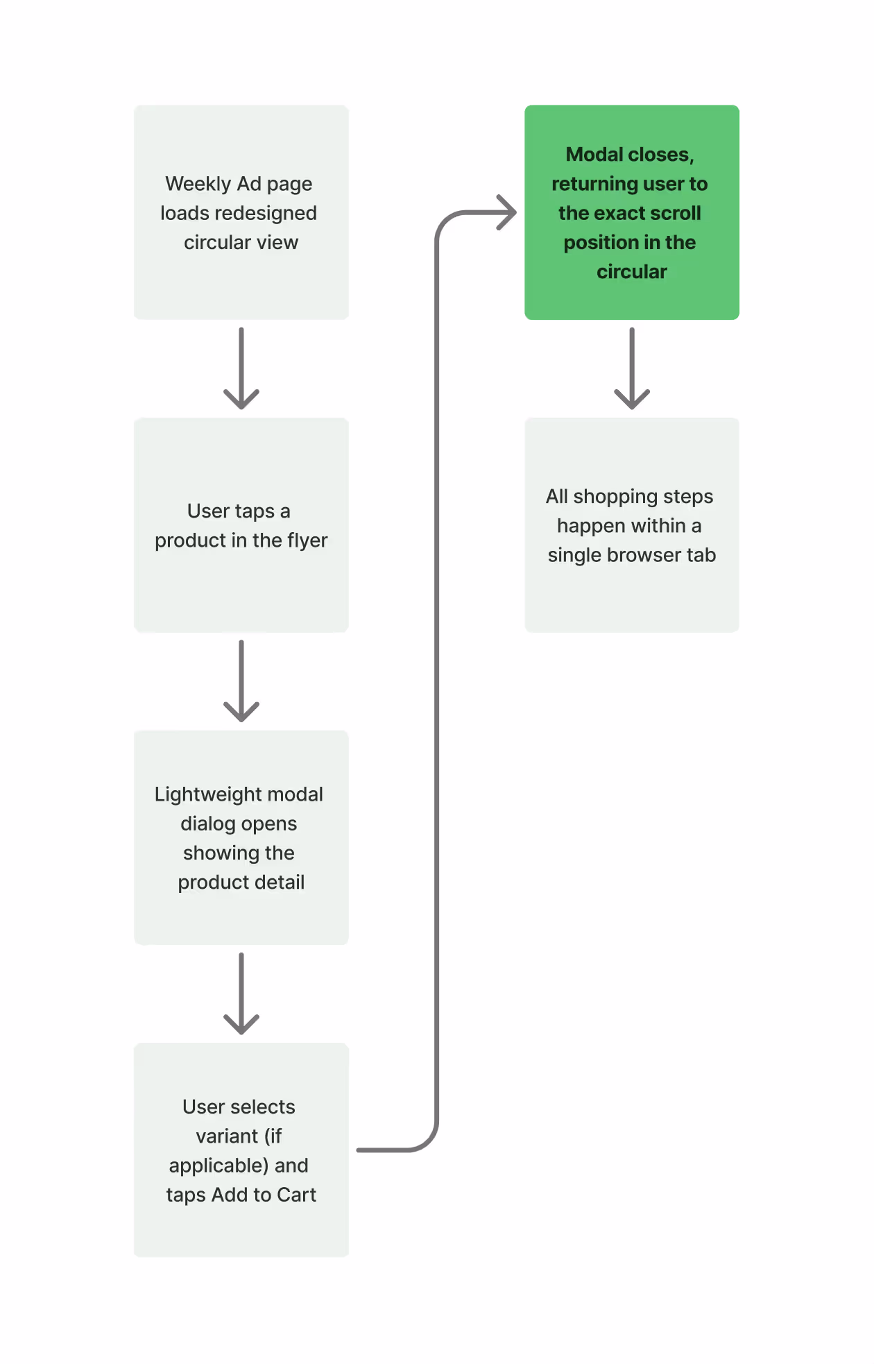
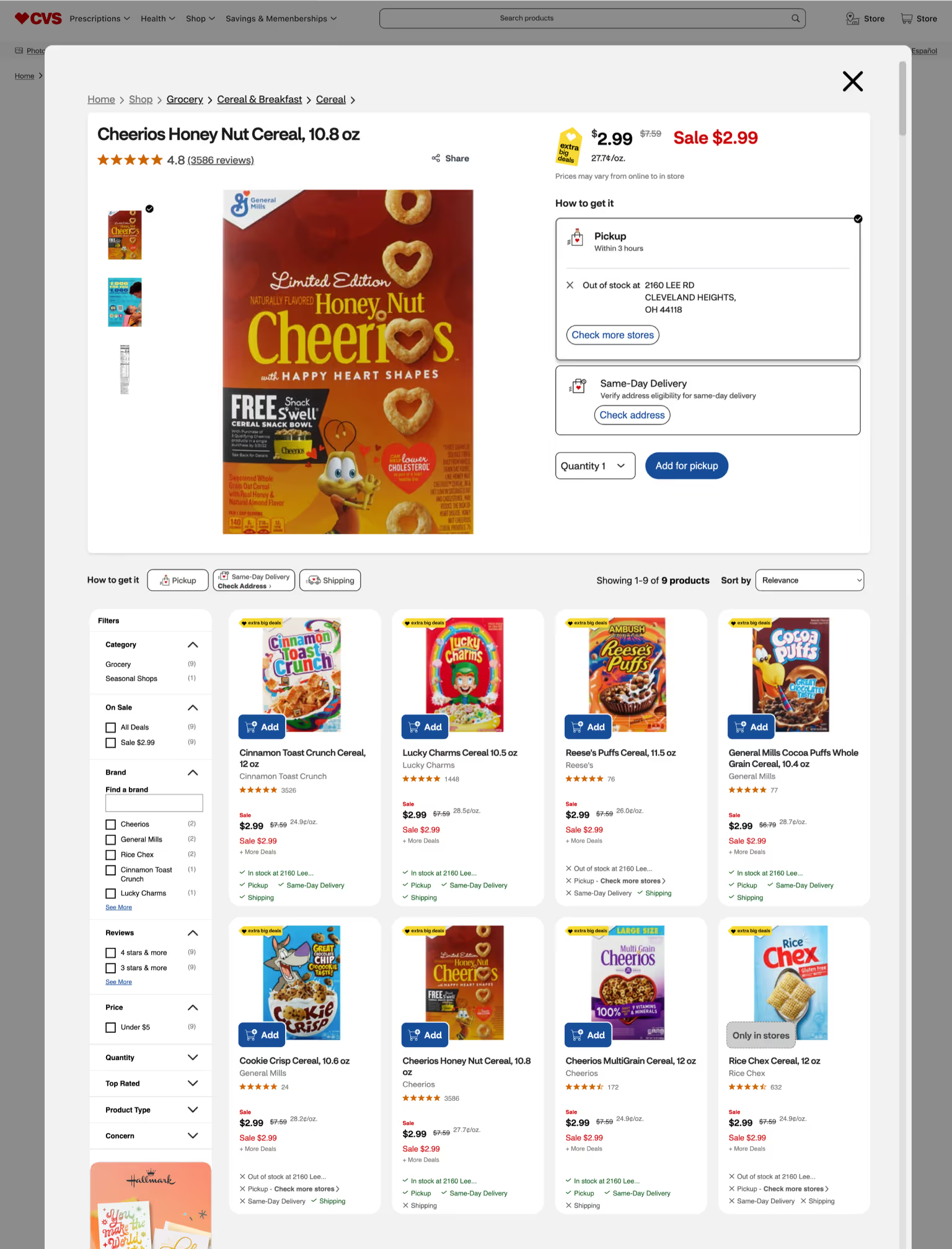
In the original Weekly Ad experience, the circular is delivered via a third‐party iframe that isolates product interactions from CVS’s native site. In Page View, tapping an item launches an inline panel that masquerades as a PDP but lacks true add-to-cart functionality, forcing users to click “Shop Now” and spawn a new browser tab to a vendor-managed PLP of qualifying products. From there, selecting any SKU opens yet another tab to the full product detail page—fragmenting the shopping journey across multiple windows, externalizing session control to the browser, and introducing needless cognitive and navigational overhead. List View fares no better: it exposes promotional details but provides no direct purchase path, leaving users unable to shop from the list itself.
The redesign consolidates every shopping step within a single, cohesive browser context while still honoring CVS’s deep-linking requirements with manufacturers. Selecting any flyer item now opens a lightweight, platform-native modal PDP—complete with variant selection, pricing details, and an Add to Cart button—and closes back into the exact scroll position in the circular. A persistent “See All” link can still route to a full PLP for those rare cases of extensive product assortments, but only within CVS’s own interface. This streamlined flow restores intuitive session management, preserves user focus on the flyer, and eliminates the tab-spawning disruptions that plagued the original design.
Before
After

Heuristics-Based Redesign of Weekly Ad Shopping Flow
In the original Weekly Ad experience, the circular is delivered via a third‐party iframe that isolates product interactions from CVS’s native site. In Page View, tapping an item launches an inline panel that masquerades as a PDP but lacks true add-to-cart functionality, forcing users to click “Shop Now” and spawn a new browser tab to a vendor-managed PLP of qualifying products. From there, selecting any SKU opens yet another tab to the full product detail page—fragmenting the shopping journey across multiple windows, externalizing session control to the browser, and introducing needless cognitive and navigational overhead. List View fares no better: it exposes promotional details but provides no direct purchase path, leaving users unable to shop from the list itself.
The redesign consolidates every shopping step within a single, cohesive browser context while still honoring CVS’s deep-linking requirements with manufacturers. Selecting any flyer item now opens a lightweight, platform-native modal PDP—complete with variant selection, pricing details, and an Add to Cart button—and closes back into the exact scroll position in the circular. A persistent “See All” link can still route to a full PLP for those rare cases of extensive product assortments, but only within CVS’s own interface. This streamlined flow restores intuitive session management, preserves user focus on the flyer, and eliminates the tab-spawning disruptions that plagued the original design.
Page View
List View
PDP Modal
PDP Page


Reflections & takeaways
Following the heuristic evaluation of the original Weekly Ad experience, I restructured the page to eliminate systemic UX failures tied to information architecture, interaction design, and cognitive load. The goal of the redesign was not merely to modernize the aesthetic, but to fundamentally correct broken navigation patterns, clarify content organization, and restore intuitive user flow for flyer-based shopping.
Key architectural corrections focused on restoring the correct relationship between content navigation and view controls. The redesigned experience elevates the weekly version selector (This Week, Next Week, Spanish) to primary navigation, while demoting view toggles (List View, Page View) to secondary display settings. This reflects the correct information architecture: users must first establish their content context before adjusting how they view that content.