back arrownext arrow

Prototyping a solution for improved visibility of system status and one click login for Pluto TV

A smart TV displaying Pluto TV

Date Completed

April, 2022

Overview

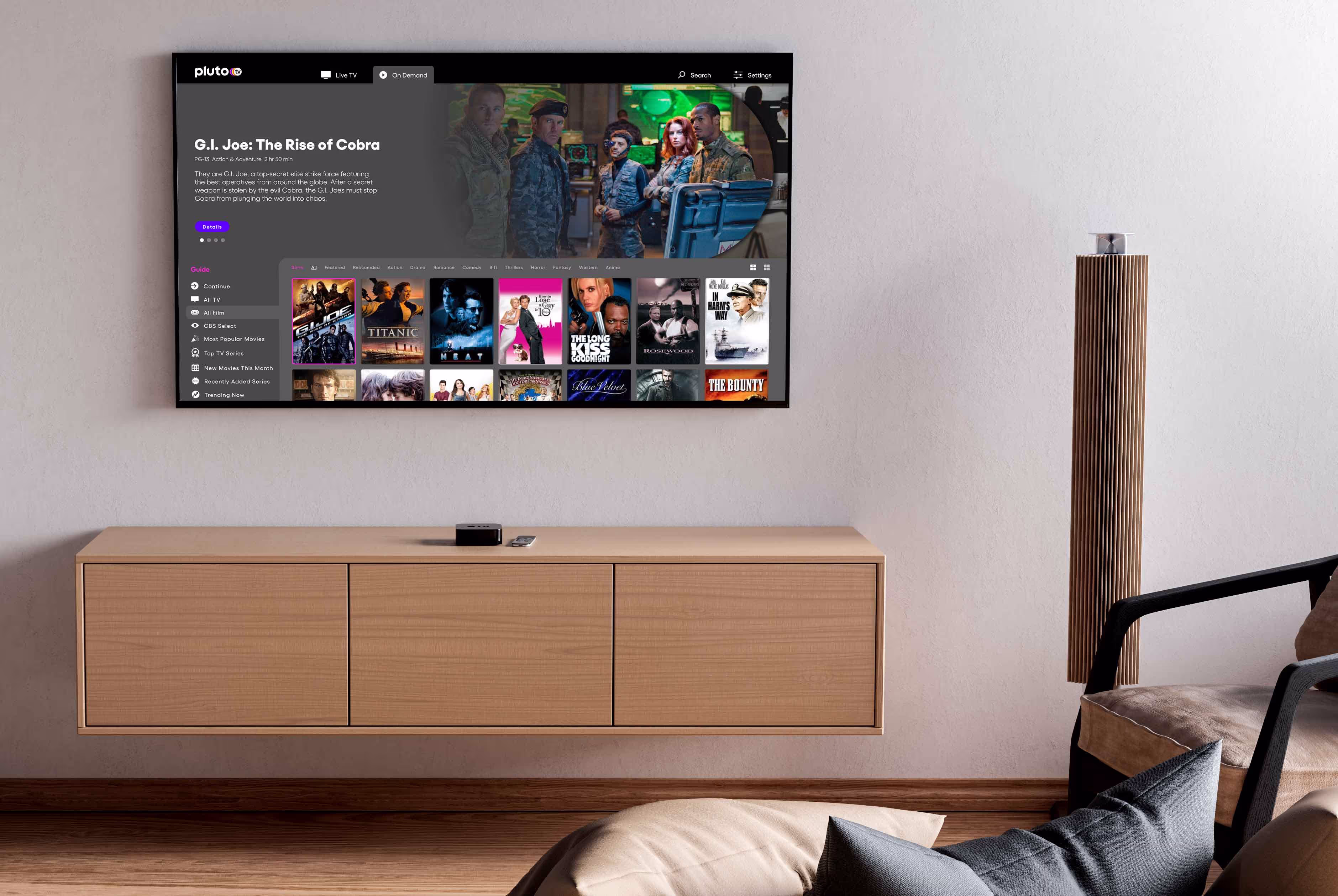
Pluto TV is a Paramount company offering a streaming alternative to broadcast TV. With a global audience of nearly 50 million monthly active users, Pluto TV, is the leading free streaming television service.

Completed in two days as concept sample work for an interview with the company, this initiative focused on the heuristic, visibility of system status. (currently adding content from this study)

Goals

  1. Simplify use by tv remote
  2. Reduce user time to selection of a title
  3. Incorporate genre categories
  4. Implement multiple paths to login, and single click login
Current Interface
Download Figma File

Process

learn

After reading about Pluto TV and their channel surfing UX 
approach, I loaded the app on a Roku TV and started documenting their user journey along with competing platforms

Pluto TV's new UX

The team at Pluto TV has produced a user experience to emulate the single click channel surfing experience of broadcast and cable TV. They describe this as a "liner UX". Live tv channels are organized as genre categories. Up and down selections are made with a remotes direction pad. Up and down selection while viewing a title, plays the next selection without preview or interruption.

On demand follows the same "linear" experience with genre category rows browsed by right clicks through titles to a view all after a dozen.

Pluto TV on Roku

Other platforms

63% of Netflix users also subscribe to Amazon Prime and %50
subscribe to Hulu & Disney according to Statistica. This multiple
platform use presents challenges for users where functionality is
inconsistent across platforms.

Youtube's UI is top down category rows organized by the familiar conceptual model of tabs. Forgoing the hero section, youtube places personal recommendations at the top, however they have not included profiles found on Netflix and Paramount for recommendations for multiple household users.

Category sorts are organized as a row of pills allowing users to save time by selecting a pill rather than scrolling down to the same category. Details for titles are presented as a page, however the page does not display the title description which requires an additional selection of "about". Back button use return the user to the top nav.

Netflix places a global persistent left hand nav of icons which animates in to reveal category names when the user reaches the leftmost option of the UI. Unlike Youtube Netflix retains a hero section which auto plays previews sacrificing screen real-estate. Some users report autoplay previews as distracting and annoying. Account profiles provide personalized categories and continue watching selections.

Category navigation is located outside of the primary top down row navigation experience where it is likely missed by many users. Title details pages show a preview and title details in addition to recommendations. Back button operation opens the left nav at the home location. Selection returns the interface to  the top category.

Amazon uses a global persistent top nav organized by the familiar conceptual model of tabs. Unlike Netflix Amazon's default displays a mix of category and marketplace content in rows.

Amazon has few categories. Top nav contains Movies & TV. Unlike Youtube, there are no options for browsing genres. Category rows are a mix of profile based recommendations, some of which are genre recommendation categories.

Back button operation on Amazon is, back a step, rather than back to the top. Details pages have no preview and title description is hidden for access by button selection.

Paramount has chosen to build a UI that is consistent with the leading platform Netflix. A left nav of categories animates in to display category names added to icons.

Back button operation on Amazon is, back a step, rather than back to the top. Details pages have no preview and title description is hidden for access by button selection.

Understand

With a better understanding of Pluto TV's UX strategy and goals I moved on to mapping a user journey and heuristics analysis

History based default state

Pluto TV has engineered their UI to support returning to where the user left the application in their previous session. This isn't something the user expects. This saves the user a few clicks but does it at a cost. Users will not always be intending to pick up from where they were in their last session. Returning after days of absence, a user who was watching an action movie will see the UI load with the categories scrolled to that selection. This is a system status challenge that could be avoided by always loading the application in a default state. Users interested in what they were watching in their last session have the option of selecting from the "continue watching" category.

On Demand

Pluto TV has engineered their UI to support returning to where the user left the application in their previous visit. This isn't something the user expects. This saves the user a few clicks but does it at a cost. Across several sessions I discovered that the first use of a day played a loading animation and dropped into playback of a live TV title. Exiting the application and returning even after an hour had elapsed loaded up my location from the previous session. This experience is documented in the recordings above.

Pluto TV has engineered their UI to support returning to where the user left the application in their previous visit. This isn't something the user expects. This saves the user a few clicks but does it at a cost. Across several sessions I discovered that the first use of a day played a loading animation and dropped into playback of a live TV title. Exiting the application and returning even after an hour had elapsed loaded up my location from the previous session.

Live TV

Pluto TV has engineered their UI to support returning to where the user left the application in their previous visit. This isn't something the user expects. This saves the user a few clicks but does it at a cost. Across several sessions I discovered that the first use of a day played a loading animation and dropped into playback of a live TV title. Exiting the application and returning even after an hour had elapsed loaded up my location from the previous session. This experience is documented in the recordings above.

Pluto TV has engineered their UI to support returning to where the user left the application in their previous visit. This isn't something the user expects. This saves the user a few clicks but does it at a cost. Across several sessions I discovered that the first use of a day played a loading animation and dropped into playback of a live TV title. Exiting the application and returning even after an hour had elapsed loaded up my location from the previous session.

Login

Pluto TV has engineered their UI to support returning to where the user left the application in their previous visit. This isn't something the user expects. This saves the user a few clicks but does it at a cost. Across several sessions I discovered that the first use of a day played a loading animation and dropped into playback of a live TV title. Exiting the application and returning even after an hour had elapsed loaded up my location from the previous session. This experience is documented in the recordings above.

Pluto TV has engineered their UI to support returning to where the user left the application in their previous visit. This isn't something the user expects. This saves the user a few clicks but does it at a cost. Across several sessions I discovered that the first use of a day played a loading animation and dropped into playback of a live TV title. Exiting the application and returning even after an hour had elapsed loaded up my location from the previous session.

define

With a better understanding of Pluto TV's UX strategy and goals I moved on to mapping a user journey and heuristics analysis

History based default state

Pluto TV has engineered their UI to support returning to where the user left the application in their previous session. This isn't something the user expects. This saves the user a few clicks but does it at a cost. Users will not always be intending to pick up from where they were in their last session. Returning after days of absence, a user who was watching an action movie will see the UI load with the categories scrolled to that selection. This is a system status challenge that could be avoided by always loading the application in a default state. Users interested in what they were watching in their last session have the option of selecting from the "continue watching" category.

Arduino landing page sitemap IA redesign flowmap
usable logo